When form meets function
 Sometimes we have the privilege of revisiting a project as a family grows and changes and the unfinished spaces of a home are ready to be planned and developed. This was the nature of a recent opportunity at a house on Occom Pond, where a family of Dartmouth alumni and current Dartmouth students discovered they needed more space for family and friends to feel welcome.
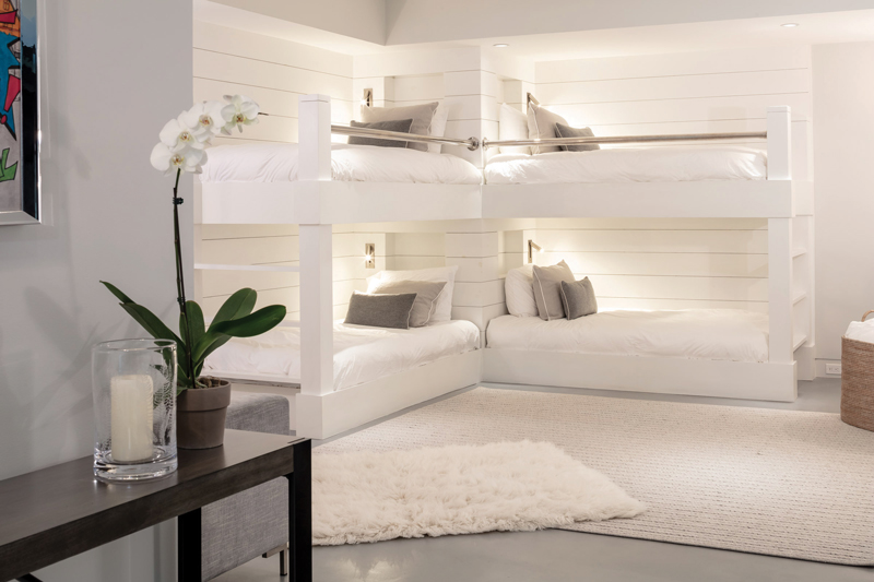
Part of this project took place in the lower levels of the home, where we created a cozy bunk room out of an unfinished basement where previously only the walls had been plastered and the concrete floors sealed. This is no ordinary bunk room—each of the four personal sleeping areas is outfitted with adjustable LED reading lights and power outlets, plus USB ports for charging devices. And each bed features nooks perfect for storing personal effects and reading materials. The lighting in the bunks along with the niche design and power outlets is something that is not fundamentally difficult to achieve but it’s the type of details most people don’t consider. In the end, having your own personal space to charge a phone or keep a book right by your bed is what makes a guest feel at home.
 These bunk beds are a classic example of the detail and expertise Gilberte Interiors brings to every project. The design we present drives the project, but the ability to use the right materials and finish with the workmanship that demands attention to each and every detail is our strength. Even the bedding—custom duvets and pillows—was fully considered and created in our own workroom on Allen Street, Plus, our ability to both design and fabricate the elements means we can offer our clients an unusual service; in these times, we are uniquely able to move projects forward with minimal delay.
At the house on Occom Pond, we also focused on making the guest bathroom a space that was elegant and beautiful, far from what you might typically think of as a basement bathroom. Wonderful mosaic stone tile, a balance of white and colorful touches, plus an abundance of glass and light make this room inviting.
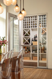
 Upstairs, we turned out attentions to transforming a cooled space off the kitchen and dining space into a true wine room. We wanted to organize the wine for an enticing visual backdrop while making it easier to store and grab a bottle rather than search through cartons.
The challenge was to create a space that was visually alluring and still had an abundance of storage options. The was creating racks and shelves that all look uniform in size but are subtly different in order to house an array of wine bottles along with crates. We used white finish and a smoke glass countertop that really enables the bottles and labels to stand out.
It’s always a pleasure to get the opportunity to work on a house and fully realize the pieces that started as wishes and became the details that make a house and a distinctive and enjoyable home.